Last Updated on September 22, 2016 by David
Reamaze is now sporting new colors!
Colors are a funny thing. They evolve over time. They influence features and features influence them right back. It’s a continuum of excitement, a grab bag of ooohs and ahhhs.
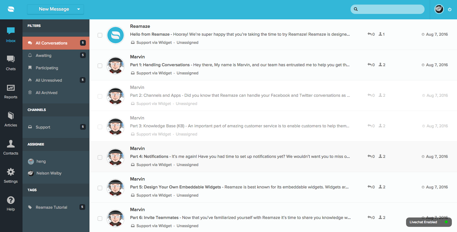
In the past few years, we’ve leaned on specific colors and palettes to guide the UI. Reamaze was originally green, then blue, then a flatter and more muted blue. Darker grays made its way to the UI in early 2015 and with it came more features that leveraged the darker tone for balance. Then different shades of gray and the first hint of orange debuted in late 2015.
With more features coming in 2016, we’ve decided to introduce a new palette that better utilizes contrast, space (and negative space), and balance. You’ll begin to feel more fluidity as new features and updates roll out over the next few months.

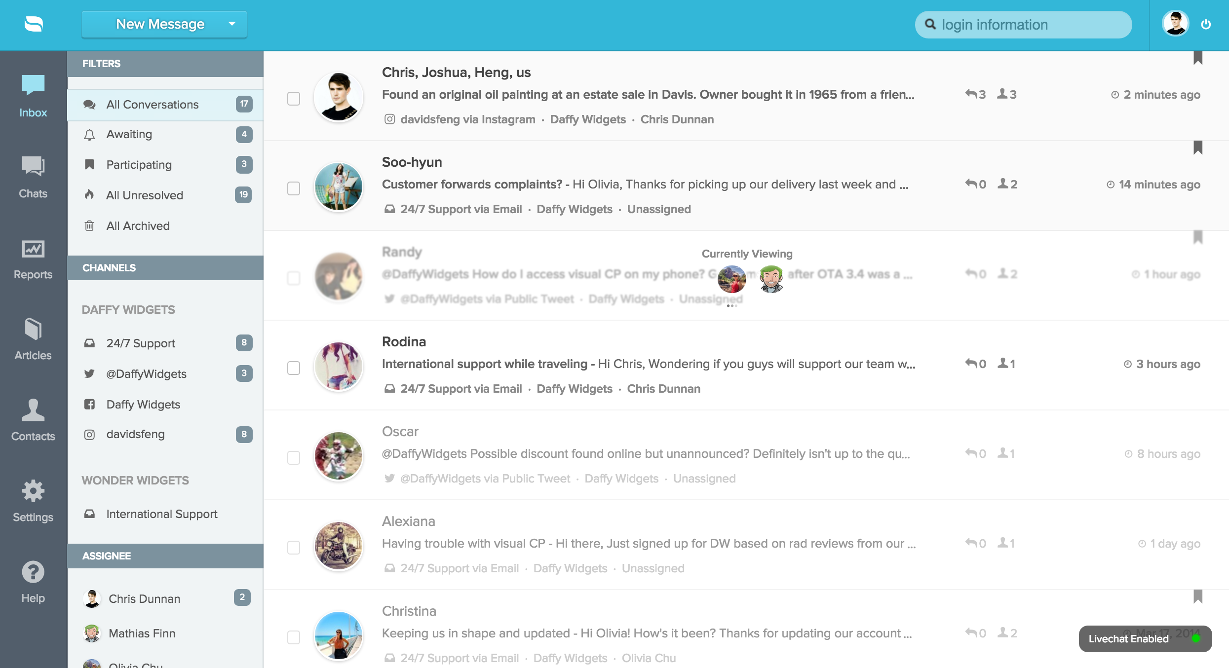
Here’s what’s new:
- Darker left nav gives more focus to the conversation pane.
- Contrasting grays in the conversation pane for resolved and unresolved conversations give subtler cues in terms of what needs attention.
- Orange highlights make pinpointing filters a breeze.
- A flatter look gives the UI more consistency.
- More space in general to support incoming updates.
Now this wouldn’t be a proper unveil without a blast through the past!
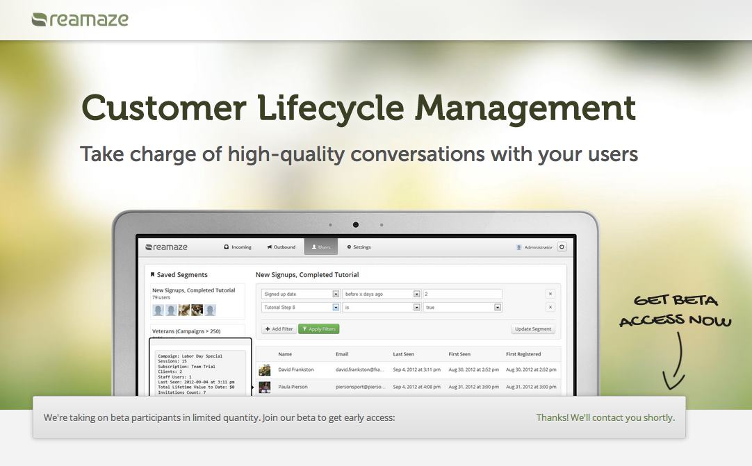
2012
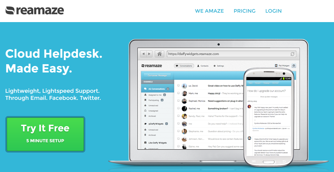
2013
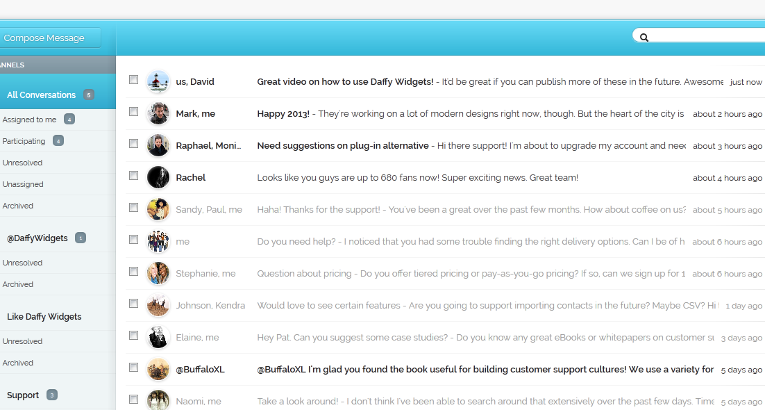
2014
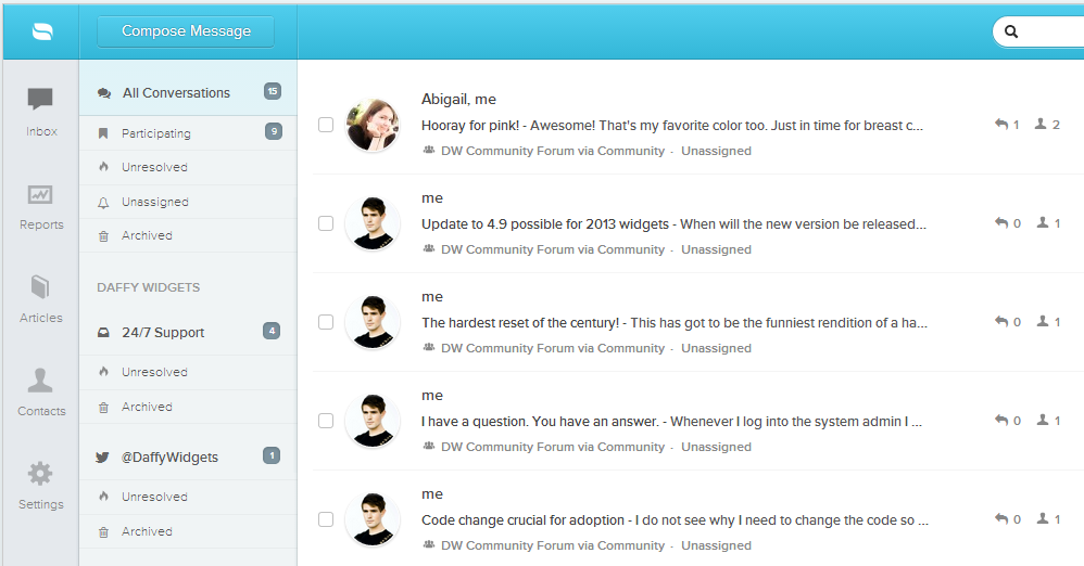
2014.5
2015
2016
Read more of our thoughts, ideas, and rants on Medium! Follow our publication at betterthansure.com.
Twitter | Facebook | LinkedIn | YouTube
Cheers!
– Team Reamaze