Last Updated on September 26, 2017 by David
Remember when we got new shoes last year? It was almost exactly a year ago when we introduced the new Reamaze dashboard and its new colors.
Reamaze has grown rapidly in the past year and we’re now serving millions of conversations monthly. Outside of performance and stability optimizations, there are two things we learned during our rapid growth that are crucial to an extraordinary experience: ease of navigation and high readability.
An Airier Palette
We’ve optimized the Reamaze dashboard by reducing high-contrast components and brightening the entire UI so your eyes can scan through textual content more efficiently. Combined with changes to spacing, subtle font scaling, and animated actions, the new dashboard should be a place where you won’t mind spending a few hours in every day!
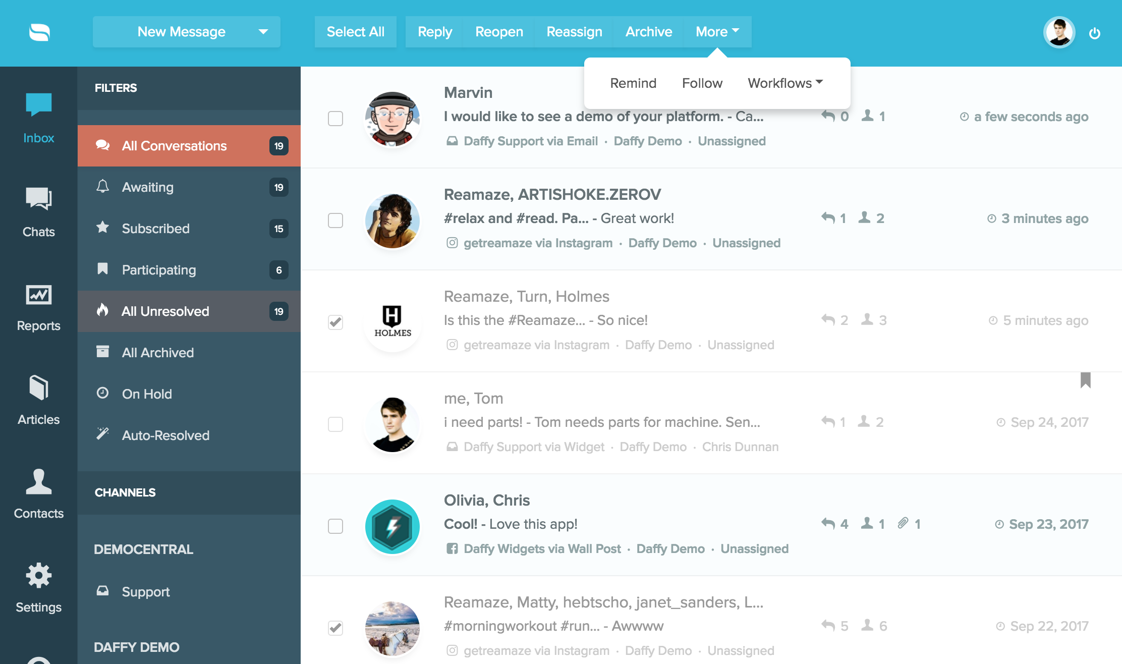
You’ll also find brand new menus and buttons laid across the user interface to accommodate the airer design philosophy. These elements now lay flatter against the UI to bring more focus onto the action that’s about to take place.
More Alertness
Reamaze will now show you conversation statuses at the top left hand corner. Now you won’t mix up a resolved conversation from an unresolved conversation. Conversations that are on-hold (reminder active) and archived will also be represented by their own respective color icons.
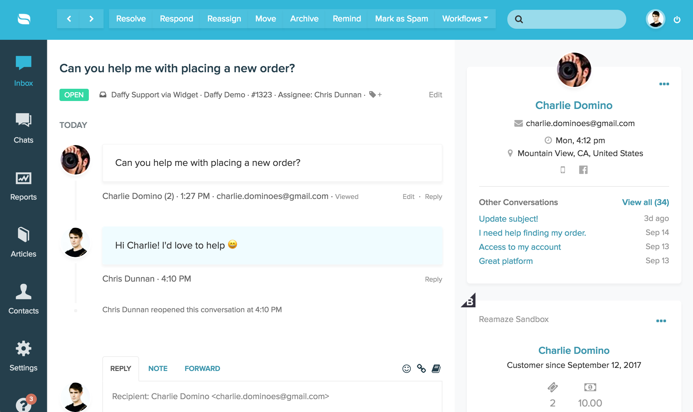
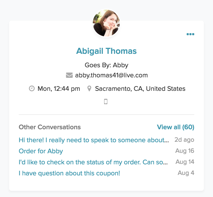
In addition, Reamaze now supports IP-based location and timezone information to help you better authenticate and service customers. You can also start a new conversation or view a customer’s various other identities on the customer’s profile card.
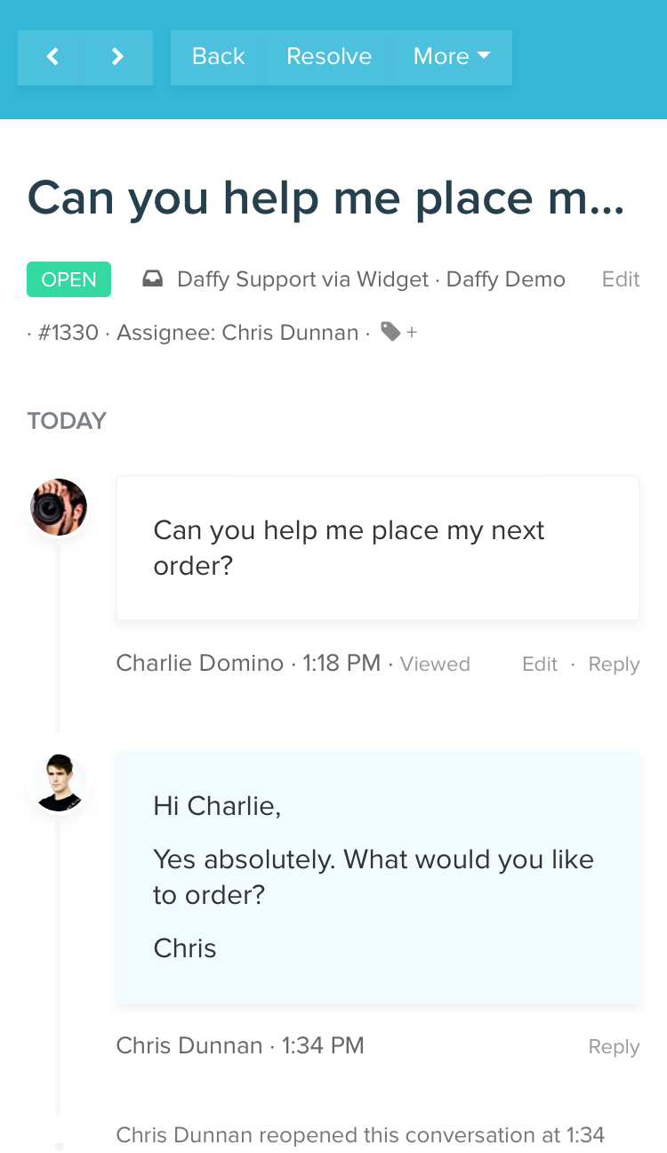
Mobile App Update
The new design carries over to the Reamaze mobile app as well!
Enjoy!